Nokia reveals new logo on eve of the Mobile World Congress
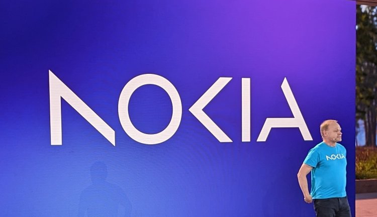
Nokia announced plans to change its brand identity for the first time in nearly 60 years, complete with a new logo, as the telecom equipment maker focuses on aggressive growth.
The new logo comprises five different shapes forming the word NOKIA. The iconic blue colour of the old logo has been dropped for a range of colours depending on the use.
"There was the association to smartphones and nowadays we are a business technology company," Chief Executive Pekka Lundmark said.
After taking over the top job at the struggling Finnish company in 2020, Lundmark set out a strategy with three stages: reset, accelerate and scale. With the reset stage now complete, Lundmark said the second stage is beginning.
While Nokia still aims to grow its service provider business, where it sells equipment to telecom companies, its main focus is now to sell gear to other businesses.
Major technology firms have been partnering with telecom gear makers such as Nokia to sell private 5G networks and gears for automated factories to customers, mostly in the manufacturing sector.
Nokia plans to review the growth path of its different businesses and consider alternatives, including divestment.
The market to sell telecom gear is under pressure with macro environment denting demand from high-margin markets such as North America, being replaced by growth in low-margin India, pushing rival Ericsson to lay off 8,500 employees.